Ayodeji Areago
My Role:
Product Designer & AI Director
Duration:
2 Weeks
The Challenge
The brief from Leye Ogunsanya was simple: use the Moonchild AI platform to design a festival ordering app . The real challenge wasn't just what to design (a useful app), but how to design it. You can read the original challenge brief here.
I knew from my first tests that AI could be messy and inconsistent . My real goal was to see if I could actually tame it and get a clean, user-friendly app, not just a bunch of weird, random screens.
The Solution
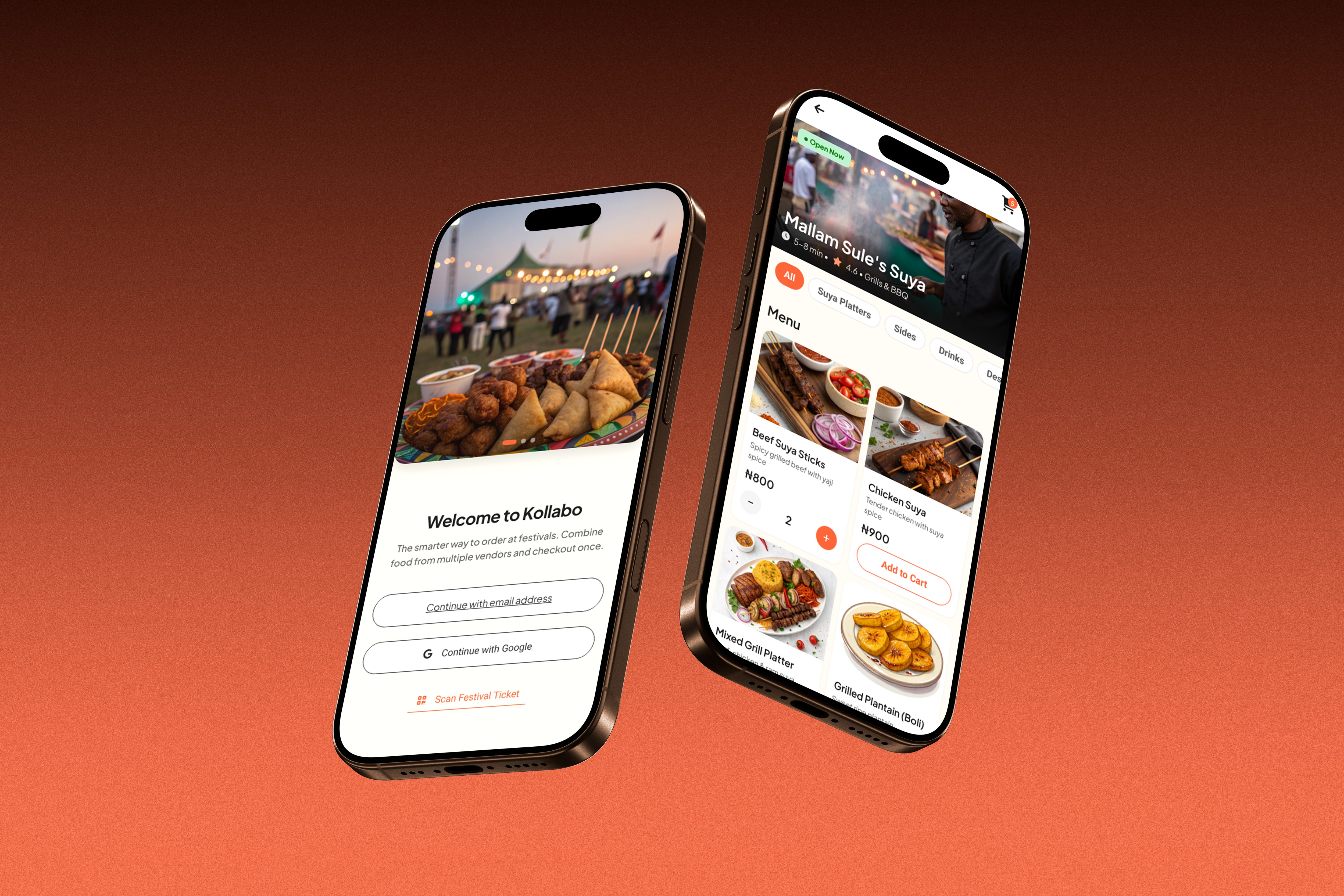
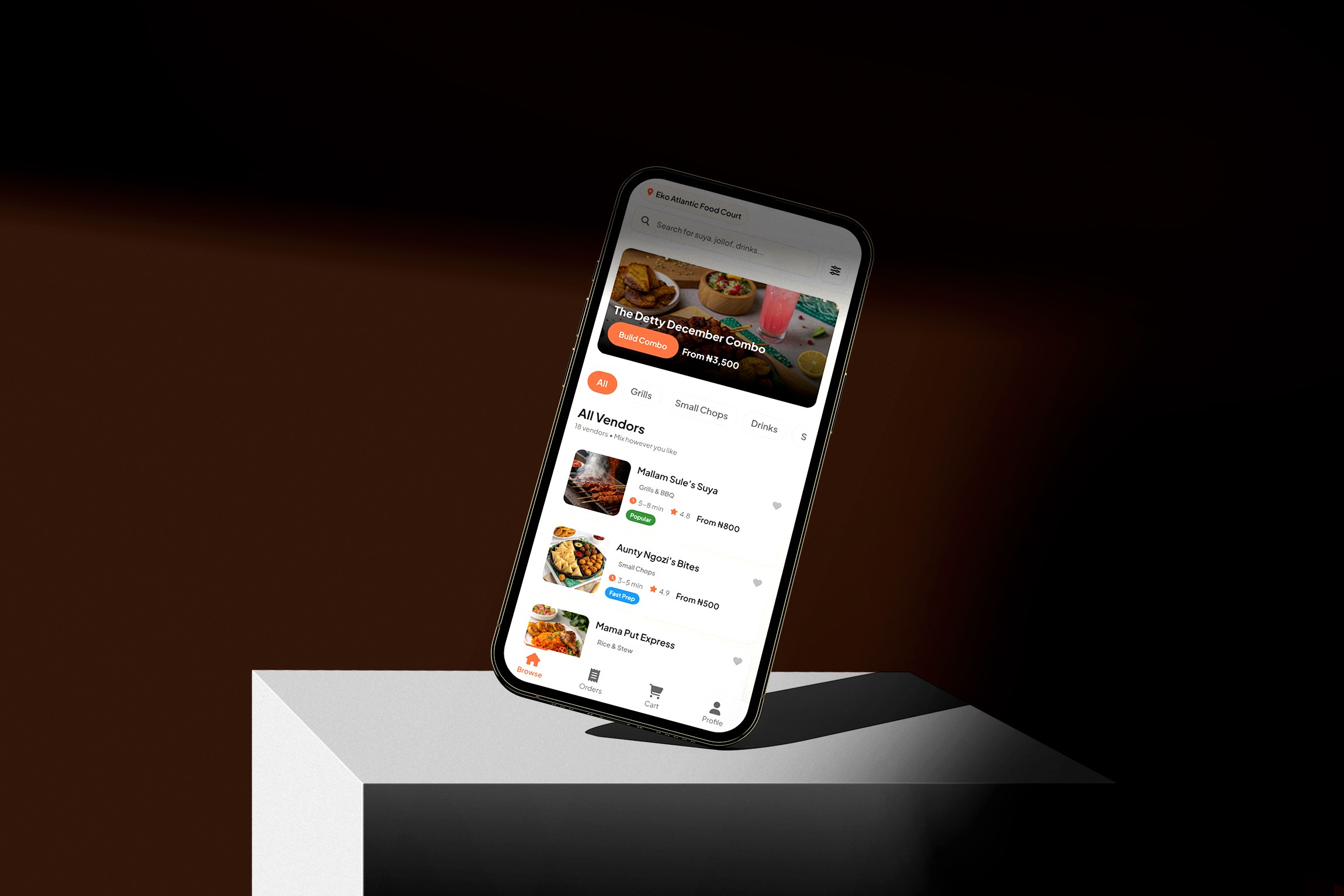
I ended up with "Kollabo." The name comes from the core idea I had: letting users collate orders from all over a festival into one simple cart and payment flow . The final design is clean, clear, and (I'm proud to say) won 2nd place - Check out the announcement tweet here.
This wasn't a normal design process. It was a lot of testing, failing, and figuring things out . Here’s what I discovered.
Part 1: Finding the Idea
Before writing a single prompt, I just played with Moonchild AI to see what it could do . I realized the biggest pain point at a festival is ordering from 10 different food vendors. So, I came up with the name "Kollabo" to fix that . That one idea—collating orders—became my guiding star for every prompt.
Part 2: The "Aha!" Moment (Giving the AI Rules)
While Moonchild AI was great and generating different concepts fast, the tendency to be inconsistent was also high. My "aha!" moment came when I realized I could feed it a simple design system . This was the game-changer.
By giving it my colors, fonts, and button styles, I could force it to be consistent. For me, this was the key. I wasn't just a designer anymore; I was its director.

Part 3: The Art of "Prompting"
This whole experience taught me: your prompt is everything . I had to learn the exact names for UI elements. I even used Gemini on the side to help me find the right words (e,g "bottom sheet" vs. "modal") to describe what I wanted .
Part 4: The Human Cleanup (The Most Important Step)
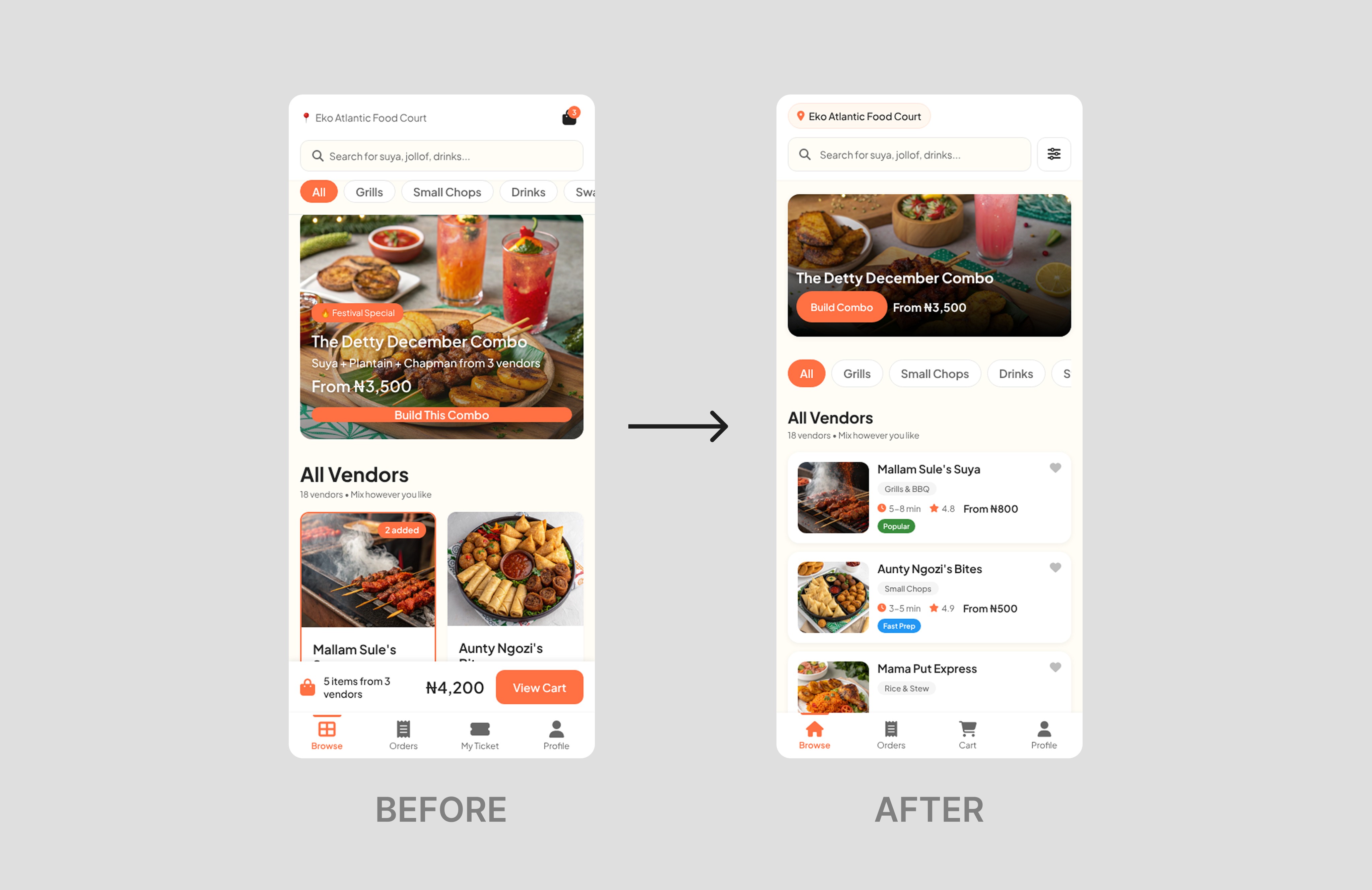
AI is a clutter generator. It just... adds stuff. Extra icons, weird gradients, too much color. My final, and most important, job was just cleaning up the mess . I went through every screen and de-cluttered, simplified, and rewrote the copy to make sure it actually made sense for a real person .
The Final Product
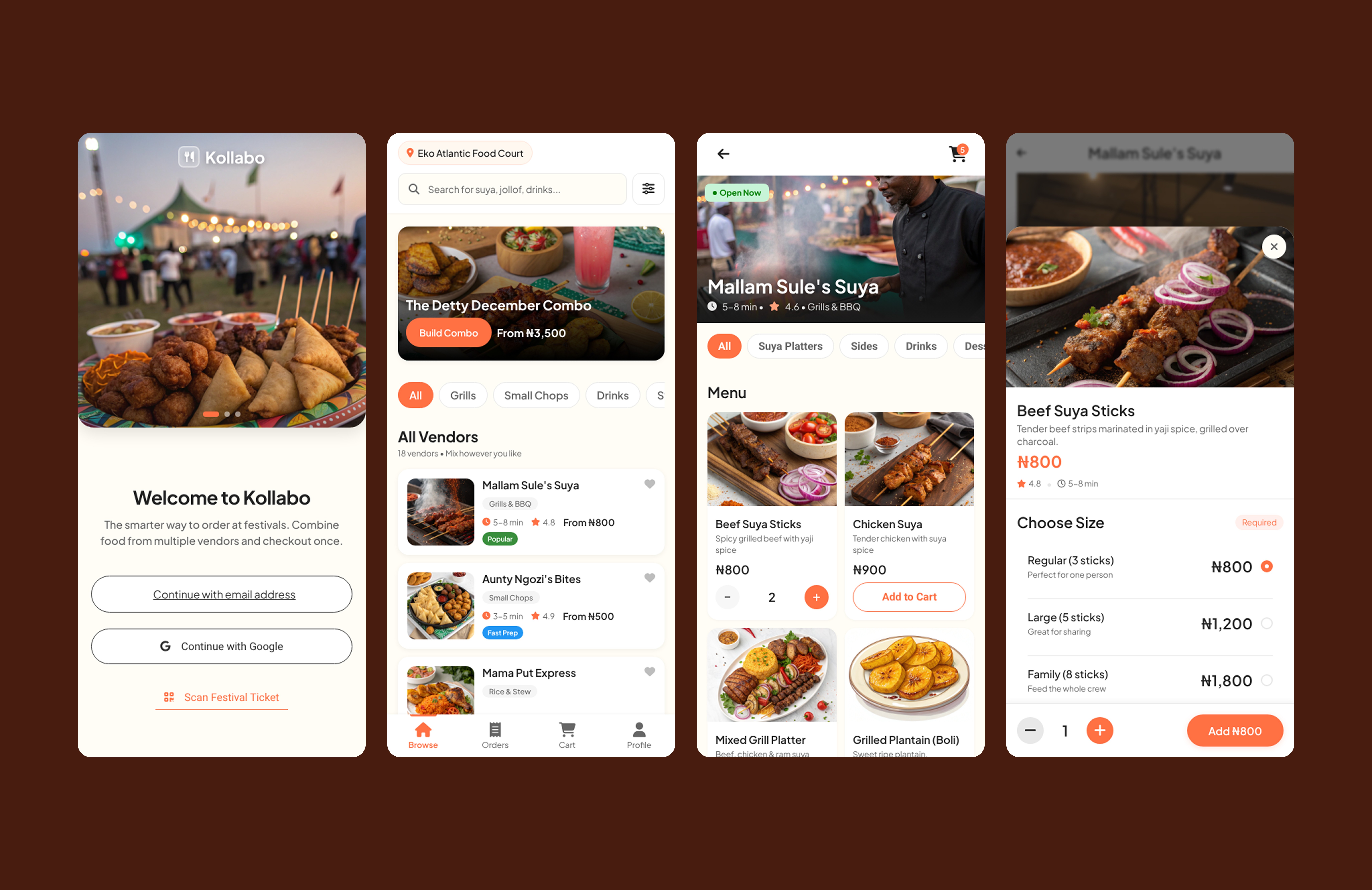
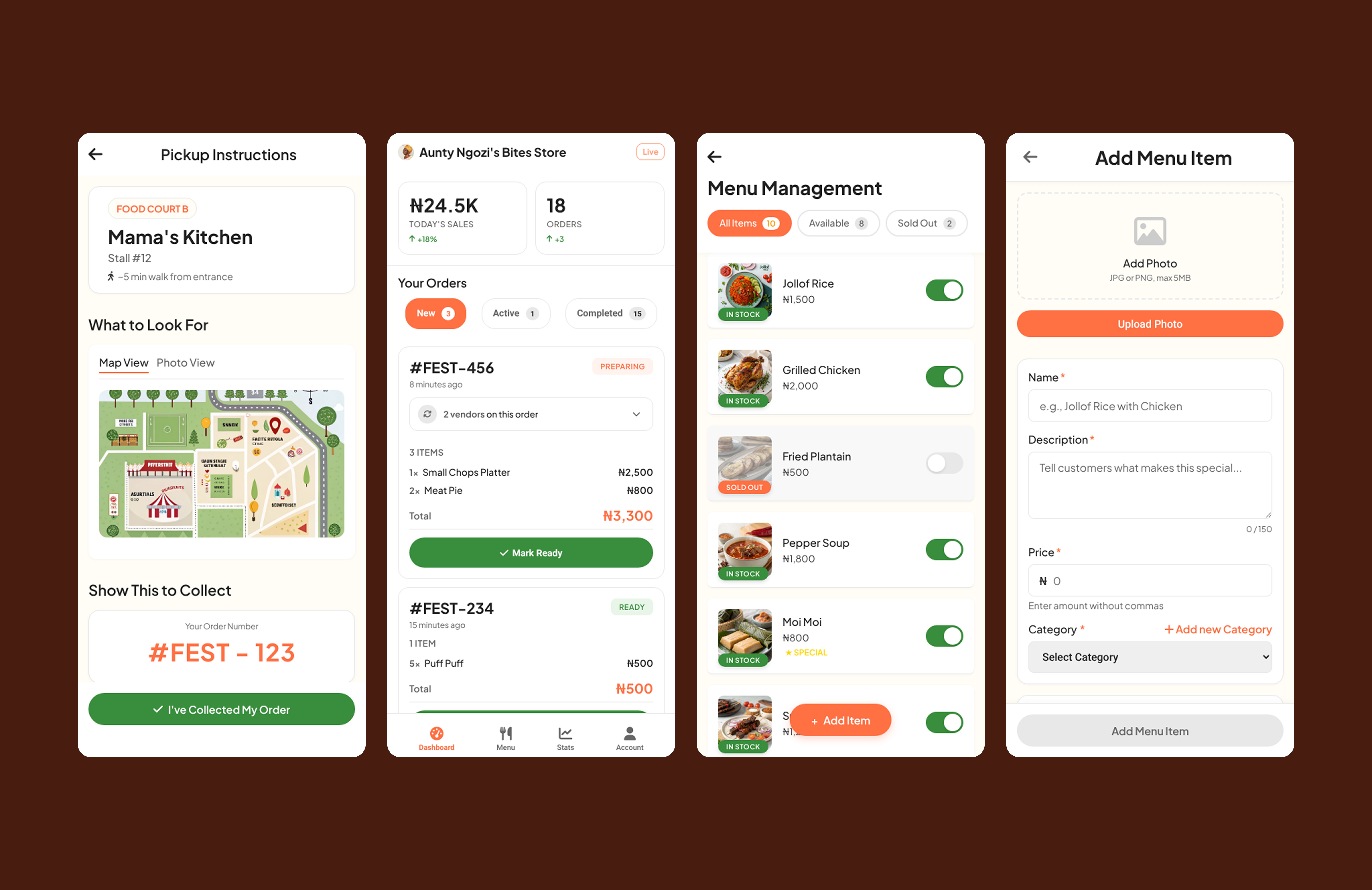
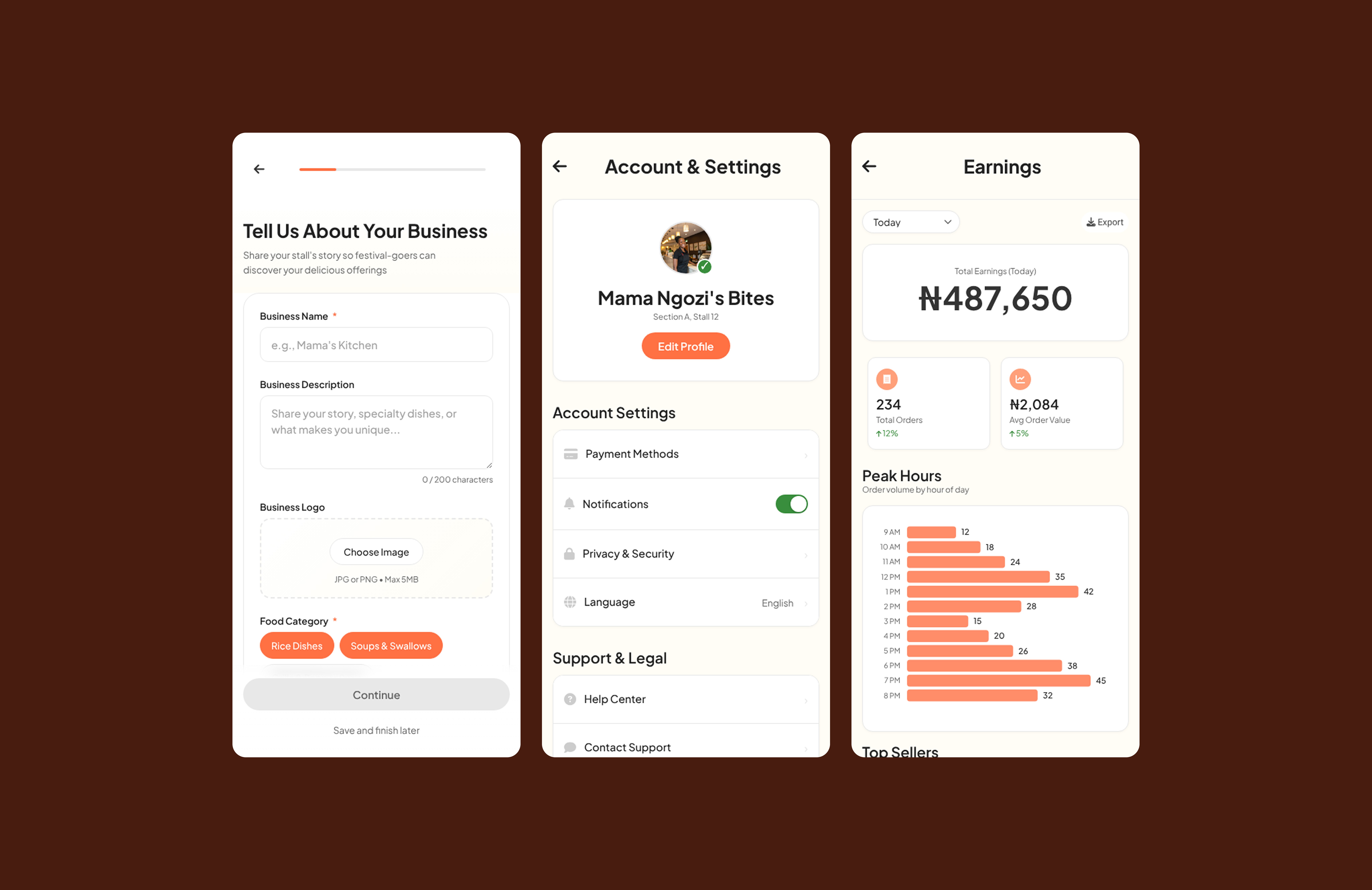
After a lot of cleanup, this is what I ended up with. A clean, simple, and (I hope) easy-to-use app.

Insights
This project really changed how I think about designing with AI.
The designer's job is becoming "Curator." My job wasn't to push pixels; it was to be the AI's director and, most importantly, the user's guardian. I had to be the one to say, "No, that's too much" .
Give AI a leash. A design system is the leash . Without it, the AI just runs wild. Clear rules were the only way I got usable results.
Empathy is still 100% human. AI is a tool. It can't understand what it feels like to be at a busy festival, trying to find your food. That's still our job.
